The Best and Worst Times to Post on Social Media Networks [Infographic]

Timing: A key element of social media marketing strategy

When it comes to social media, timing is everything. Opportunities to capture attention and engagement are fleeting, so you've got to strike when the traffic is right to maximize your reach.Think of the Five Ws of journalism — Who? What? When? Where? Why? — when crafting a post and keep the WHEN top of mind. WHAT you post is of utmost importance, but you also need to plan WHEN to post it WHERE in order to reach the WHO you'd like to hook. When is your target community most likely to be tuned in and responsive? What's the prime time to spark a conversation?The folks at Social Caffeine created this infographic to illustrate the best and worst times to post on Twitter, Facebook, LinkedIn, Pinterest and Google+.Best times to post on Facebook and Twitter 

Disclaimer: Content may settle during transit...

Naturally, the times above may vary by industry, target audience and other factors. But use this infographic as reference alongside your analytics, or combine your own intuition and hard data.

So what's the method to your social media marketing madness?

Do you connect with early birds over coffee on LinkedIn? Party (engage) with night owls on Pinterest? Do the prime time frames above for Facebook and Twitter ring true to you? Do you ever just wing it? Please share your findings below. Thanks!

Foolish Infographics (April Fool's edition)

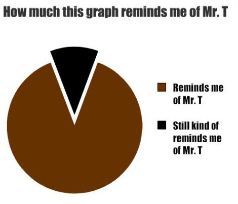
I'm always on the lookout for good infographics. As a "visual learner" and follower of trends in information design, I'm both delighted and bemused by the daily flood of data visualization on the Internet. Often I'm more enamored with the execution than with the content itself, so when I come across a silly "mock" infographic, the joke's on me.Here are some of my favorites:Infographic: Mr T Pie Chart 

Ben Greenman's Charts About Graphs and Graphs About Charts

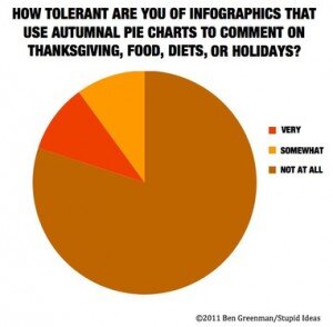
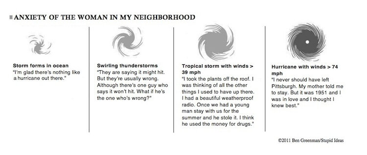
This series on McSweeney's is funny and spot-on. My top picks:Infographic from McSweeney's Infographic from McSweeney's  Infographic from McSweeney's

For more funny examples, check out:

McSweeney's Internet Tendency: Ben Greenman's Graphs About Charts and Charts About Graphs

Left vs. Right: Re-visualizing the political spectrum (in polarizing times)

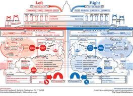
l vs rClick for full size version: Left vs. Right: A Visualization of the Political Spectrum

Fair and balanced

Back in January I posted this infographic on my Facebook page as an interesting example of information design. I found it thought-provoking, but didn’t bother to articulate why.Then this morning, I was watching a TED talk on YouTube with information designer David McCandless, and up popped the same chart. (Ironically, I had just come indoors after pulling my collection of political yard signs out of the ground, hoping to appease my neighbors.)Viewing the graphic nearly a year later, in the aftermath of the cut-throat mid-term elections, it struck me as quaint and out of date. The hues of red and blue now looked too subdued, the lines too soft around the edges. It's a friendly looking graphic, in contrast to the technicolor FOX News one in my mind.And I guess that's part of the point -- and perhaps the chief reason it begs a second look. These are polarizing times, and we desperately need to find some commonality.

Oh say, can you see...

As McCandless eloquently described the thought process behind his infographic, I scribbled down his words (on Post-its, the back of an envelope, and the margins of the comics section of the Boston Globe). Here’s the bit that resonated with me most:talk"When I was designing this image, I desperately wanted this side, the left side, to be betterthan the right side (...being a journalist type, a left-leaning person). But I couldn’t because I would have created a lopsided, biased diagram. So in order to really create a full image I had to honor the perspectives on the right-hand side, and at the same time I had to sort of, uncomfortably, recognize how many of qualities were actually in me—which was really, really annoying... and uncomfortable. "But not too uncomfortable ... because there’s something unthreatening about seeing a political perspective versus being told or forced to listen to one. You’re capable of holding conflicting viewpoints, joyously even, when you can see them."

consiousnessA matter of perspective

"That’s what’s exciting for me: to see how data can change my perspective and change my ideas, even mid-stream."

-- David McCandless, author of Information is Beautiful,
available on Amazon.com and at informationisbeautiful.net
Watch the entire TED Talk here:

David McCandless: The beauty of data visualization (Click on link above. The Left vs. Right bit is at 14:50.)