Web content and the eternal home page question: How much is too much?

 education websites | xkcd venn diagramI love this Venn diagram by xkcd. It was projected on the wall at the start of a Future M seminar I attended this September called “Beyond the University Website – The Future of Digital Marketing in Higher Education.” This image keeps coming back to me, in content decisions for both edu and B2B.Sponsored by ISITE Design, and moderated by chief strategy officer Jeff Cram, the panel included Mike Petroff, Web and Technology Enrollment Manager at Emerson College; Perry Hewitt, Chief Digital Officer at Harvard; Gene Begin, Digital Marketing Director at Babson College; and Tom Baird, Vice Chancellor of University of Michigan Dearborn.

Content Overload? It's all about balance.

I’ve been working on content strategy, optimization, writing and editing for an independent preK-8 school website this year and am about to begin on one for an independent high school. Funny how, regardless of the size of the school, the home page issues always seem to be the same.

How to balance content for current vs. prospective students and constituents? How many news feeds, blog feeds, photo and video galleries do you really need? How can we make sure it's all optimized for search? What is the true purpose of the home page anyway? How much is too much?

I'm knee-deep in content migration from one CMS to another on the above mentioned website, but once I come up for air I'll grapple with this question some more. Got any formulas for success? Would love to hear them.

FutureM wrap-ups:

Here are a couple good summaries of the FutureM seminar, along with some choice tweets on CMS quandries (as universal as the homepage ones, it seems to me), mobile stats for edu, and the need for social strategy:Open Parenthesis: Future M on Higher Educationpost by John Eckman of ISTEInside FutureM: Digital Marketing and Higher Educationpost by Erik Devaney on New England Post  

Graphic novel of Dante's Divine Comedy triumph of information design--and editing

dante-splshThis entertaining review in PopMatters made me want to run out and buy the book.It tells how illustrator and graphic designer Seymour Chwast condensed Dante’s epic 14,000-line allegory to under 120 pages, producing an accessible visual adaptation, complete with diagrams to explain the intricate circles and steps in the author's imagined world.  The approach is quirky and playful, while still capturing the spirit of Dante's daunting prose.This is neither a dumbed-down, Reader's Digest treatment nor a substitute for reading the 14th century classic. Rather, consider it a wayfinding guide to the real thing.

"Film noir, Marc Chagall and children’s picture books are among the sources which inform Chwast’s art, drawn in pure black and white, which presents Dante as a trench-coated, pipe-smoking private investigator, Virgil as a proper old-school English gentleman with a bowler hat and cane and Beatrice as a blonde, pin-curled beauty...""This is a true adaptation, not a translation, and one in which the graphics do more of the storytelling than the text. Chwast’s illustrations carry the main content of the Divine Comedy while the cantos have been greatly shorted and translated into modern prose." -- Sarah Boslaugh

Read the full review here:'Dante's Divine Comedy,' from a Left-Handed DesignerFor more insight into the creative process, in Chwast's own words, see this from Huffington Post: Divine Comedy as Graphic Novel

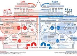
Left vs. Right: Re-visualizing the political spectrum (in polarizing times)

l vs rClick for full size version: Left vs. Right: A Visualization of the Political Spectrum

Fair and balanced

Back in January I posted this infographic on my Facebook page as an interesting example of information design. I found it thought-provoking, but didn’t bother to articulate why.Then this morning, I was watching a TED talk on YouTube with information designer David McCandless, and up popped the same chart. (Ironically, I had just come indoors after pulling my collection of political yard signs out of the ground, hoping to appease my neighbors.)Viewing the graphic nearly a year later, in the aftermath of the cut-throat mid-term elections, it struck me as quaint and out of date. The hues of red and blue now looked too subdued, the lines too soft around the edges. It's a friendly looking graphic, in contrast to the technicolor FOX News one in my mind.And I guess that's part of the point -- and perhaps the chief reason it begs a second look. These are polarizing times, and we desperately need to find some commonality.

Oh say, can you see...

As McCandless eloquently described the thought process behind his infographic, I scribbled down his words (on Post-its, the back of an envelope, and the margins of the comics section of the Boston Globe). Here’s the bit that resonated with me most:talk"When I was designing this image, I desperately wanted this side, the left side, to be betterthan the right side (...being a journalist type, a left-leaning person). But I couldn’t because I would have created a lopsided, biased diagram. So in order to really create a full image I had to honor the perspectives on the right-hand side, and at the same time I had to sort of, uncomfortably, recognize how many of qualities were actually in me—which was really, really annoying... and uncomfortable. "But not too uncomfortable ... because there’s something unthreatening about seeing a political perspective versus being told or forced to listen to one. You’re capable of holding conflicting viewpoints, joyously even, when you can see them."

consiousnessA matter of perspective

"That’s what’s exciting for me: to see how data can change my perspective and change my ideas, even mid-stream."

-- David McCandless, author of Information is Beautiful,
available on Amazon.com and at informationisbeautiful.net
Watch the entire TED Talk here:

David McCandless: The beauty of data visualization (Click on link above. The Left vs. Right bit is at 14:50.)