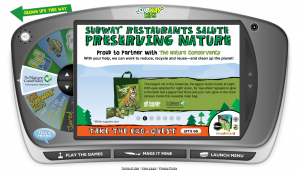
I've worked on a few copywriting and content development projects for SUBWAY® Restaurants and their SUBWAYkids.com group over the past year (via the Boston office of ad agency Jack Morton Worldwide). My latest project, an interactive game and content for a campaign developed with The Nature Conservancy, the world's leading conservation organization, is now live on the site. This spring, every SUBWAY Fresh Fit for Kids Meal comes in a reusable meal bag with a special code to unlock the interactive game and bonus eco-facts and video clips.
"With your help, we can work to reduce, recycle and reuse—and clean up the planet."
Kids play the "Eco-Quest" by picking up pieces of trash along their journey through habitats on three levels: land, air and sea. With each clean-up or successful answer to a question, users are rewarded with an eco-fact or a downloadable Nature Conservancy feature on an endangered or at-risk animal whose habitat is threatened by pollution. Check it out at www.subwaykids.com. Pretty basic, as it's designed for younger users, but kind of fun. And it was definitely fun to work on. Kudos to big corporations like SUBWAY for catching on, cutting down on waste and encouraging the use of reusables.
Speaking of Earth Day and jumping on the green bandwagon...
The Earth Day content I wrote a couple years ago for the Think Green website, developed for Discovery Education in partnership with Waste Management, is still live on their site. Check it out if you're looking for creative activities for grades K-2, 3-5, 6-8 or 9-12. The content is evergreen because, as they say, every day is Earth Day. By the way, Waste Management, the largest recycler in North America, is offering discounts on battery recycling kits for business as a special Earth Day promotion this year. Find out more about this and other features, like recycle-by-mail programs, at www.wm.com.


